
The ExpressView Designer is a data discovery and reporting tool that simplifies grouping, sorting, filtering, and aggregating data with a drag-and-drop interface. A chart can be added with a single click, and ExpressViews can be styled and saved as PDF, RTF, CSV, or Excel files.
The ExpressView Designer
Tutorials
When you open the ExpressView Designer for the first time, you will see a tutorial dialog "welcome to the ExpressView Designer." The tutorial is designed to teach new users of the application how to build ExpressViews.
Click Learn How to begin the tutorial, or click skip tutorial to go straight into the designer.
If you choose to skip the tutorial, you are prompted to disable the tutorial and the hints. If you do not want to see the tutorial the next time you open ExpressView, select Disable Tutorial. If you do not want to see any additional help content in ExpressView, select Disable Hints.
Tutorial dialogs
Each stage of the tutorial shows a dialog with some information on how to use the indicated feature and an animation indicating how to interact with the feature. You cannot interact with ExpressView while the tutorial is open.
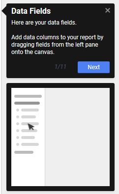
ExpressView Tutorial window
When you complete the tutorial, you are prompted to choose whether to see the tutorial again the next time you open ExpressView.
Certain actions within ExpressView spawn a special kind of tutorial called a Hint. Hints give some extra information on features in ExpressView, while still allowing you to interact with the application. Once closed, hints will not appear again.
Re-enabling tutorials
If you have finished a tutorial or seen a hint and you want to see it another
time, you can re-enable the tutorials or hints using the User Preferences menu.
Click the User Preferences  icon to see the available
options:
icon to see the available
options:
Use the ExpressView Tutorial checkbox to enable or disable the tutorial.
Use the ExpressView Hints checkbox to enable or disable the hints.
Click Reset All Hints to re-enable hints you have already seen.
Making an ExpressView
ExpressViews allow you to quickly see data and make reports without the minutiae of old-fashioned report building.
To make an ExpressView:
Click the Create New Report  icon and select
  ExpressView.
The ExpressView Designer is divided into the Data pane on the left, and the
Design pane in the middle. The Data pane comprises all of your accessible data
categories, containing groups of related data fields. Click the Choose
Data icon to expand or
collapse the Data pane.
icon to expand or
collapse the Data pane.
Expand a category by clicking the arrow  icon. This shows the fields in that
category.
icon. This shows the fields in that
category.
Drag a field onto the Design pane to add it to the ExpressView. This expands the field into a data column. It will only show placeholder data initially.
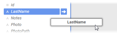
Dragging a field onto the Design pane
Continue to add fields as desired. Fields can be added or removed at any time.
 Tip
Tip
As you add fields,
unrelated fields will become unavailable. To learn about how fields relate to
each other, see Joins.
When you are satisfied with your data selection, click  Live Data in the toolbar to populate
the ExpressView with data. You can now page through your data using the
navigation icons
Live Data in the toolbar to populate
the ExpressView with data. You can now page through your data using the
navigation icons 


 in the toolbar.
 Truncated results displayed
This icon and message indicates that the report has only returned a partial data set. There are fewer detail rows than the full set, and aggregate formulas and visualizations apply only to the data that was returned to the report.
To get more data, click the icon and select either:
Click the Save  icon
to save the ExpressView. In the Settings window, enter a Name and select a
folder where it should live. Then click Save Report
Info.
icon
to save the ExpressView. In the Settings window, enter a Name and select a
folder where it should live. Then click Save Report
Info.
These steps illustrate how quick it is to make a tabular report from scratch using ExpressView. But ExpressViews can be more than basic. You can make groups, charts, calculations, and customize the look of the report. And it is all designed to be easy to use. The following sections describe how to use these powerful features.
Grouping • Managing Data • Formula Columns • Visualizations • Styling • Data Pane • Exporting
About the Radial Menu
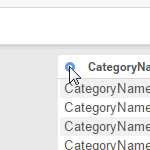
Throughout this topic you will see references to the Radial
Menu. The radial menu is a menu of options for each data column and
group, which is accessed by clicking the colored Radial  icon on the top left of the
column or group.
icon on the top left of the
column or group.
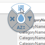
Using the radial menu
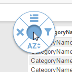
Each radial menu has four options arranged in a circle around the center.
When this guide prompts you to select a radial menu option, you will be asked to
"use
radial>direction". Direction is one of the
four cardinal directions corresponding with one of the four options:
left, right,
up, down.
For example, "use
radial>left" means to open the radial menu and select the
left option. To do this, you have two options:
To close the radial menu without selecting an option, click in the center.