
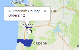
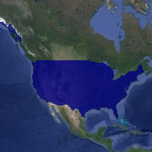
Google Maps are interactive maps that plot data per geographic area. Google Maps use data highlighting, whereby data color-codes areas in varying levels of intensity. Highlighting can affect multiple levels of granularity, to allow for drilling down into regions.
A Google Map viewed at the state level and the county level
To add a Google Map to a report, select the report cell where you want the
map to appear. Then click the  Google Map Wizard icon. Proceed
through the Locations, Data, Appearance, and Size and Preview pages, then click
Finish when you are done.
Google Map Wizard icon. Proceed
through the Locations, Data, Appearance, and Size and Preview pages, then click
Finish when you are done.
To edit a Google Map, double-click it, or select it and click the Google Map Wizard icon to
reopen the wizard.
Locations
Select the locations to use for data highlighting. Google Maps support up to six levels of granularity of locations. Some location types require data for enclosing types, in order to disambiguate location names. For each location type, select the report cell that contains the location names.
Use the following chart to determine the required data for different location types. Start at a slice and follow the chart inward to find its required locations.
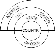
Location requirements
Alternately, you can use latitude and longitude to place drop pins at coordinates on the map.
 Caution
County and Zip Code
locations are only available for data based in the United
States.
Data
Select the data to highlight each location, and optionally, additional metrics to see in a tooltip when hovering over a location. The Primary Metric sets the data highlighting.
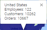
Hover tooltip with three metrics
To add a metric, click  Add
Metric.
Add
Metric.
To delete a metric, click the Delete  icon next to the metric to delete. There
must be at least one metric.
icon next to the metric to delete. There
must be at least one metric.
For each metric:
Select the report cell that contains the data for that metric from the Metric list.
Choose how to aggregate the data from the Agg. Type list.
Select None to display a cell value within the drop pin tooltip.
Enter a label for the metric in the Labels field. The label will show in the hover tooltip.
Optional: Click the Number Format  icon to change how the data values will
show in the hover tooltip. See Cell
Format for details.
icon to change how the data values will
show in the hover tooltip. See Cell
Format for details.
Appearance
In the Primary Metric Colors pane, determine the color range to use for highlighting. Do one of the following:
Select a Theme. For most themes, lighter highlight colors represent lesser values, and darker colors represent greater values.
Choose Linear Range and select a custom color range. The highlight trends towards the first color for lesser values, and towards the second color for greater values.
Selecting Show Legend adds a legend in the bottom left corner of the map that displays a color scale for reference and the minimum and maximum values of the currently visible regions.
 Tip
Tip
Areas with no data
are not shaded.
In the Metric Levels pane, you can select which levels of location are highlighted. Clear the check box for a level to prevent highlighting and drilling down into that level of data.
You can also select whether to Display Drop Pins instead of highlighting for the lowest location level available in your data.
Conditional Drop Pin Colors
Use this menu to dynamically modify a drop pin color based on its value. This action is similar to conditionally formatting cells in a report.
To conditionally set the drop pin colors for a Google Map:
Click Add to
insert a new conditional statement.
Select a color that the drop pin will become when a condition is met.
Click the formula  icon to open
the formula editor. Write a formula that returns True() or False() to indicate
whether the pin should use the specified color. Conditional formulas take
precedence in order that they appear in the Conditional Drop Pin Formatting
menu.
icon to open
the formula editor. Write a formula that returns True() or False() to indicate
whether the pin should use the specified color. Conditional formulas take
precedence in order that they appear in the Conditional Drop Pin Formatting
menu.
The following special parameters are available within the Conditional Drop Pin Formula Editor:
@metric_value_<index>@: The values of the data metrics added in the Data tab, serialized in the order of their creation.
Additionally, the locations defined in the Location tab are available to use as conditional parameters.
Click Okay when done.
Size and Preview
Determine the size, initial view, and style of the map.
Set the initial view by panning and zooming the map.
Drag in a direction on the map to pan. Click the zoom buttons to zoom in
 and out
  .
.
To set the size, either:
Drag the lower-right corner of the map
Select the Set specific size check box and enter Height and Width values
Select the Fit map to cell check box to scale the map to the size of the cell
Select the style of map from the Base Map list.
Road map versus Terrain map